A LITTLE RANT
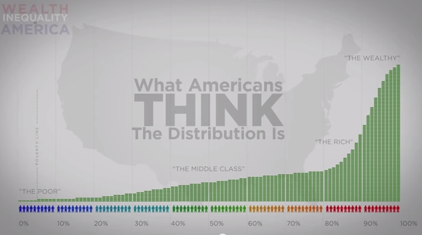
The info. in the video below shows that most people, even if they're dirt poor, working two jobs to buy clothes for the kids, can't afford a vacation, etc. think they're middle class!
Here's a little challenge to Marxists (in fairness, non-Marxists too) who want to promote "class consciousness!" Not only do a vast majority of the proletariat in the United States think they're middle class, but social mobility in the U.S. (making more money than parent(s) is worse than in any other industrialized country! Of course, the gap in income and wealth accumulation, between the rich and the poor, continues to grow. Yes there is a class war in the U.S. and the rich have won!
Studies show that most Americans do not believe any longer in the "Myth of The American Dream," where one does make more money than ones parents. And most Americans are aware that most of the jobs created today are low-paying, no benefits dead enders. But, if you don't know that having to work two jobs to barely keep your head above water doesn't put you in the "working class," (proletariat) and not middle class, this old Marxist stuff about "Comes the revolution we'll all be eating strawberries and cream" sure ain't gunna happen!
Personally, I don't want a revolt of the oppressed proletariat. But I would sure like to see some upscale version of the New Deal. Everyone, in my view, just by virtue of being a precious human being, and thereby being endowed with dignity, worth ad infinite value, deserves, as a matter of right, access to food, clothing, shelter, medical care, education, clean air and water, beautiful public spaces to be in, and all of the rights guaranteed in the Constitution and the Bill of Rights.
INEQUALITY IN THE U.S.: SO MUCH WORSE THAN WE THINK
Gwen Sharp is an associate professor of sociology at Nevada State College. You can follow her on Twitter at @gwensharpnv.
No comments:
Post a Comment